Seattle Pilates Collective
Logo Design, Brand Identity & Web Design
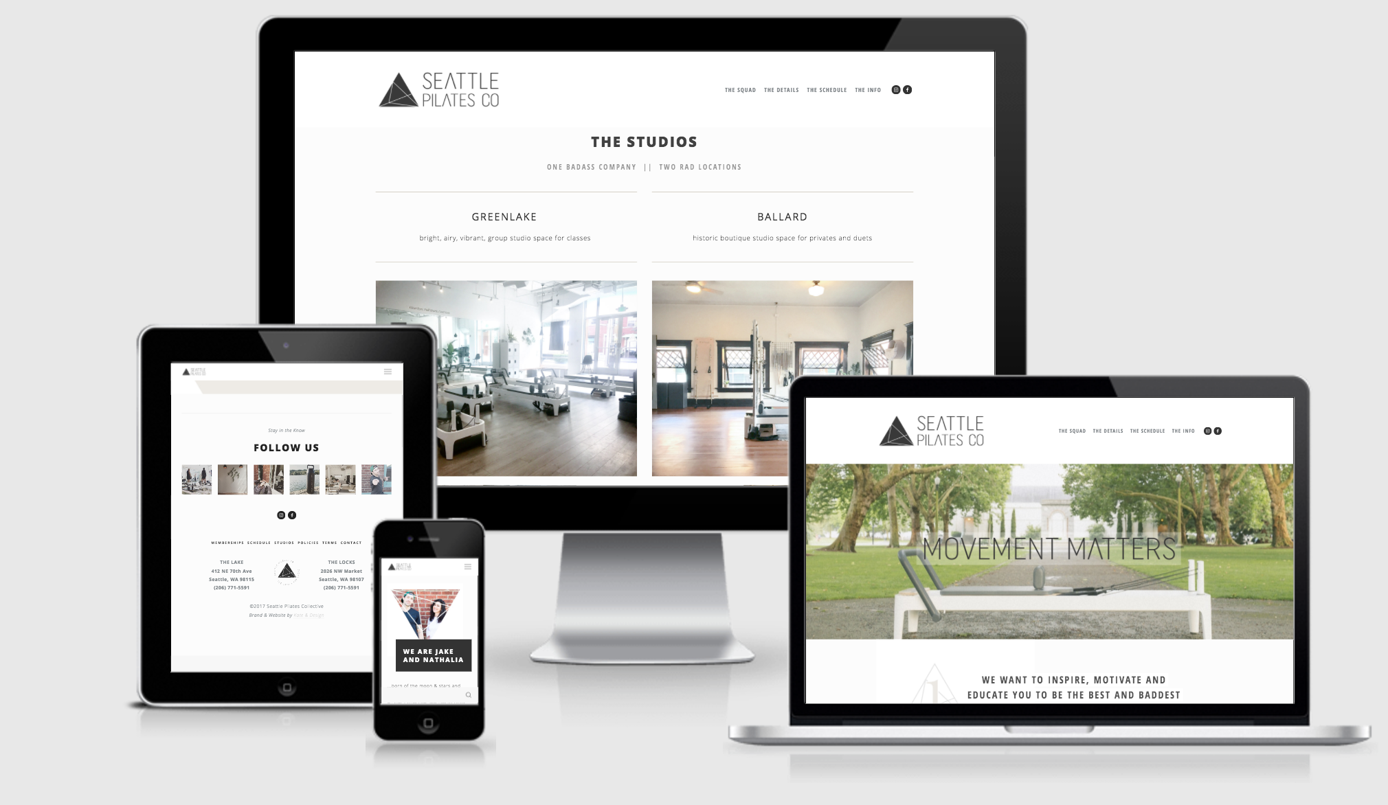
Seattle Pilates Co. is here to break away from the norm and create a community where everyone feels welcome to gather, move freely, ask questions and be their true badass self. To share the magic of Pilates and other movement modalities in a modern + sleek space.
DESIGN BREIF:
The composite moodboard focuses on creating a balance between clean and modern design, with bold + inviting elements. In order to achieve this, you’ll see a nice mix of white space and minimalism with creative imagery chopped up with edgy elemental effects. We will look for visual cues using a geometric triangle as an iconic mark to portray both strength and movement.
Utilizing these shapes and angles to support the movement aspect of your collective, the typography relies on classic sans serifs with a geometric twist. We these with an understated + tonal grey palette, with just a pop of warmer neutral to add sophistication and give the overall look differentiation from others in your industry.
LOGO RATIONALE
Staying true to the refined and modern style with an intriguing edge; this embodies the elevated experience and structure within movement you offer. The geometric mid-century type is all straight lines and perfect curves, which is such a fundamental element of Pilates.
The alternate logos allow versatility for varying situations. Stacking brand and word marks, created a nice combination for the common square avatar in social media.
Bringing a circle shape into the sharper edges of the square and triangle shapes, allows us to show more movement, as well as highlighting both your locations.